Digital Signatures are a major feature of the Mission Assurance System (MAS) web platform. How might we redesign the signatures workflow so approvals happen faster, keeping safety-critical processes moving on time?

project outcomes
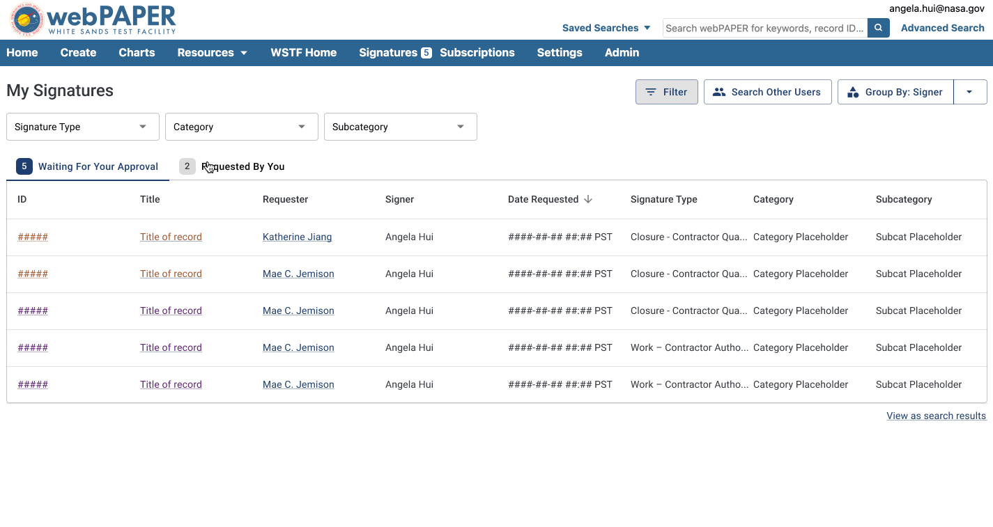
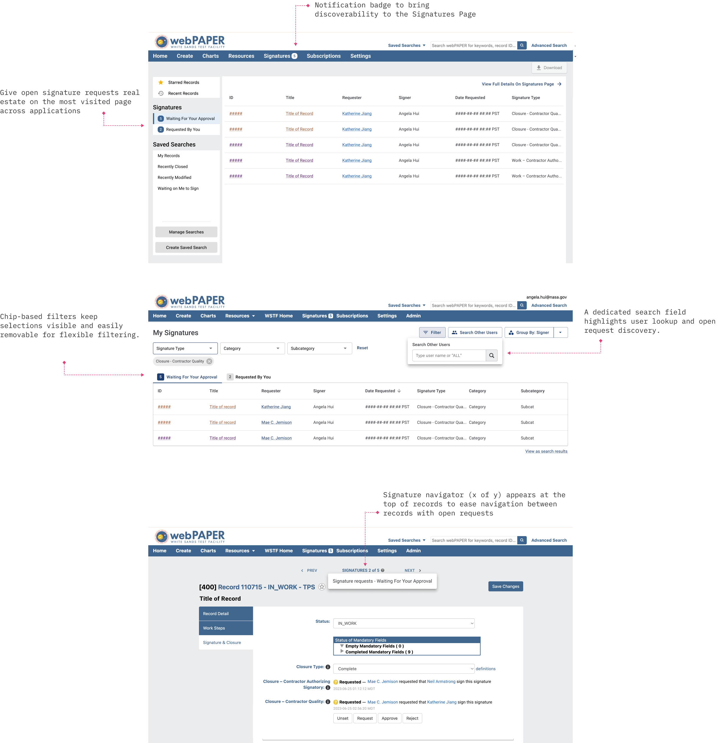
We transformed a confusing, outdated signatures experience—keeping the page's core functionality but improving the features' usability, increasing discoverability, and making the signature process run more efficiently.

01
The redesign maintained feature parity but used familiar design patterns to make it easier for users to view open requests, apply filters, and re-organize data.

02
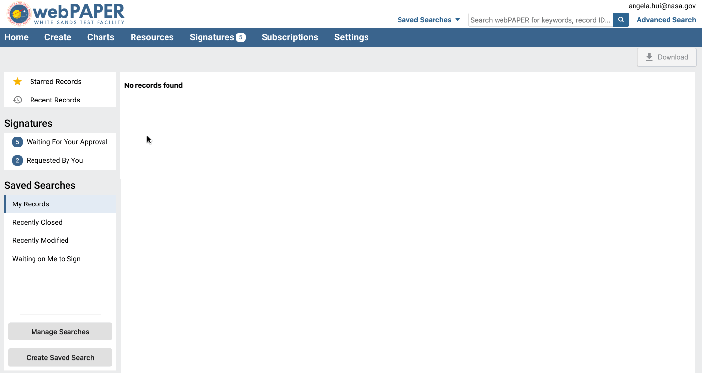
We added open signature requests to the homepage—the most visited page across all communities—ensuring that key calls to action are prominently displayed.

03
Leveraged an existing navigator feature to bring more feature consistency to the MAS platform, improving ease in navigating multiple signature requests.
RESEARCH & Discovery
Digital signatures are the approval mechanism for safety-critical processes across NASA facilities. Engineers and managers use them to approve documents, procedures, and mission assurance records before work can proceed.
With tens of thousands of signatures being requested in our 20+ applications each year, delayed signatures can hold up safety-critical work across NASA facilities, impacting mission timelines.

Signatures Page before the redesign
We conducted comprehensive user research including interviews, co-design sessions, and usability testing to identify core issues.

Templates we used during remote research sessions for card sorting and co-designs
01
Users didn't realize the Signatures Page existed and relied on system emails instead.
02
With requests hard to surface, thousands of stale requests delayed critical workflows.
03
Few participants understood or used the legacy sort/filter features on the Signatures Page.
DESIGN process
With our key research insights in mind, we began by establishing design goals to guide us throughout our iterative design phase. We spent two weeks iterating on prototypes to improve discoverability and meet both signer and requester needs.
01
Make signature requests visible where users are most active
02
Create intuitive filtering and navigation patterns

My first round of lo-fi sketches
Redesigning the Signatures Page was the core challenge—we needed to serve diverse user roles across 20+ applications while preserving critical functionality. This required systems thinking—we were designing for a major platform, not an isolated feature. Our iterations focused on making the features more intuitive without disrupting established workflows.
We explored two different approaches to filtering and grouping signatures—testing various information architectures to find the most intuitive way to surface the right data.

Customizable Concept
Surfaced filtering and grouping controls prominently, allowing users to organize by Type, Product, and other fields. Emphasizes flexibility but requires users to navigate multiple options.
.png)
Contextual Concept
Led with signatures organized by context, hiding expandable filter controls. Reduces cognitive load by surfacing actionable items first, with advanced customization available on demand.
We chose the Customizable approach because users across different roles needed flexibility to organize signatures by multiple criteria. Initial testing showed that hiding filtering controls reduced discoverability and adoption, while the platform's scale across 20+ applications demanded a flexible model to accommodate diverse user needs.
VALIDATION
We conducted 11 usability tests with users at NASA's White Sands Test Facility, our largest signatures community. Sessions (60 minutes each) included participants with different signature roles and experience levels. They completed tasks on both the legacy page and our clickable prototype, followed by a System Usability Scale (SUS) survey.
We assessed the usability of both legacy and redesign versions of the Signatures Page by comparing task completion rate and System Usability Scale scores. By both of these measures, we found that usability scores were significantly higher with the redesign.
.png)
Users found the prototype significantly easier to use and appreciated the familiar design patterns. However, testing revealed one critical insight -
Initial testing feedback led me to deprioritize certain filter fields, but later sessions revealed that the WSTF community relied heavily on those exact filters. This highlighted the importance of testing across all user communities before making reduction decisions.
FINAL DESIGNS
The redesigned signatures workflow helps users quickly find and manage their open requests, improving the overall signatures experience.

.png)